Another powerful example of data journalism and infographics.

My last blog post highlighted a really nice set of infographics from the LA Times. I want to share another with you.
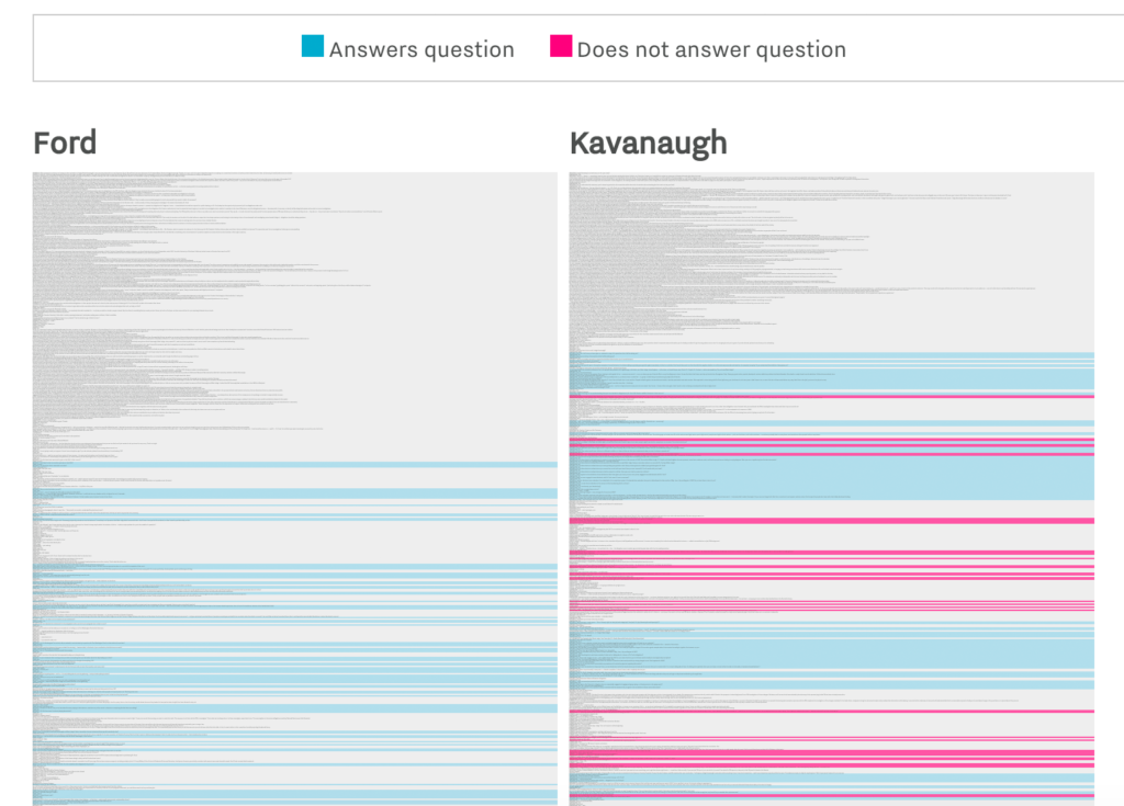
It’s about something much more serious than baseball. Like many, many, many people I watched parts of the US Supreme Court hearings this week. Or at least had a live stream open to listen to in another tab while working. This data captures one aspect of the hearing — and does it so well. It’s a really, really powerful way to make a point. To get the full effect look at it (and interact with it) directly at the Vox website.
And since this is a marketing communications blog I do need to ask the question: do you think it would help you to bring this particular form of visual storytelling (using data and very simple graphics) into how you communicate things that matter to you? It is, of course, just one type of storytelling. Note how Trevor Noah tells a similar story about this infographic in a very different way.
Another powerful example of data journalism and infographics.

My last blog post highlighted a really nice set of infographics from the LA Times. I want to share another with you.
It’s about something much more serious than baseball. Like many, many, many people I watched parts of the US Supreme Court hearings this week. Or at least had a live stream open to listen to in another tab while working. This data captures one aspect of the hearing — and does it so well. It’s a really, really powerful way to make a point. To get the full effect look at it (and interact with it) directly at the Vox website.
And since this is a marketing communications blog I do need to ask the question: do you think it would help you to bring this particular form of visual storytelling (using data and very simple graphics) into how you communicate things that matter to you? It is, of course, just one type of storytelling. Note how Trevor Noah tells a similar story about this infographic in a very different way.


Leave a response
Responses
5 responses