Content Warning: If you’re not a fan of slightly meandering creative processes, click away.
I love it when a BKW Partners / BKW Health customer makes our work better by contributing something vital. We try to encourage this with our flexible and collaborative process and even have this line in our contract: “We work on a co-creation of value model …. Together we’ll make something special.”

This happened recently in a notable way. Elaine Cheung, Chief Business Officer at Moonwalk Biosciences, brought BKW on to create Moonwalk’s website as part of the company’s plan to emerge from stealth mode with the beyond-amazing Kimberly Ha and team at KKH Advisors. (Kimberly recommended us and was part of the collaboration crew 🙏🏼🙏🏼.)
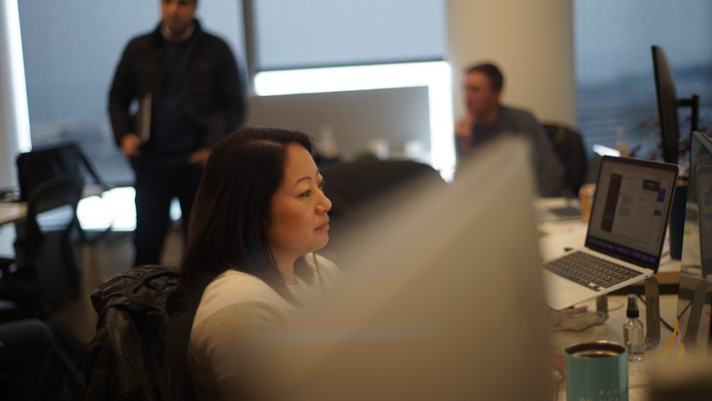
Web design for a company at Moonwalk’s stage is all storytelling. Understanding audience(s) and company/communications goals is key to blending words, visuals, interaction design, what to include, what to leave off, and in what order to present everything.
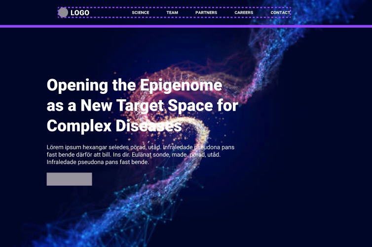
For this post I will focus mostly on visuals. We worked quickly through a few early ideas to spark conversation.

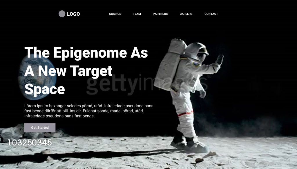
Some team members were curious about the idea of leading with a moonwalking astronaut but it felt a bit “on the nose.”
I shared a solution from a project we had just wrapped (thank you to the also-amazing Shira Derasmo / Cuttlefish) for Albatroz Therapeutics in Singapore. They HAD been leading with a play on their name too (an albatross flying across the homepage.) It felt undifferentiated. We suggested (and they liked) leading with something only they could say.
And (I am pretty sure this was Shira’s idea) we kept the albatross aspect of their story on their “About” page.
Elaine liked this approach a lot. And so the hunt was on for a cool and effective way to show Moonwalk’s differentiated science.
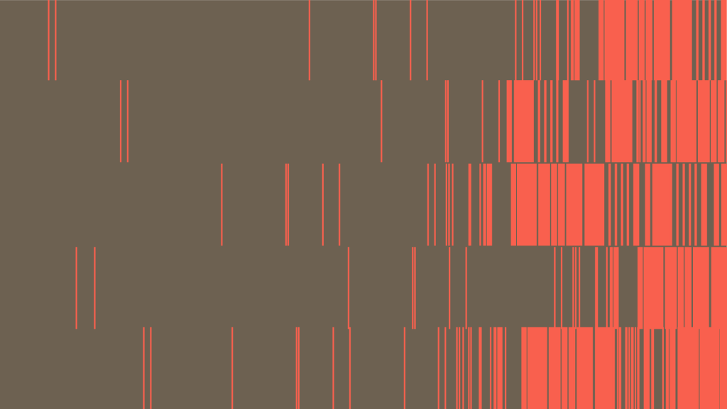
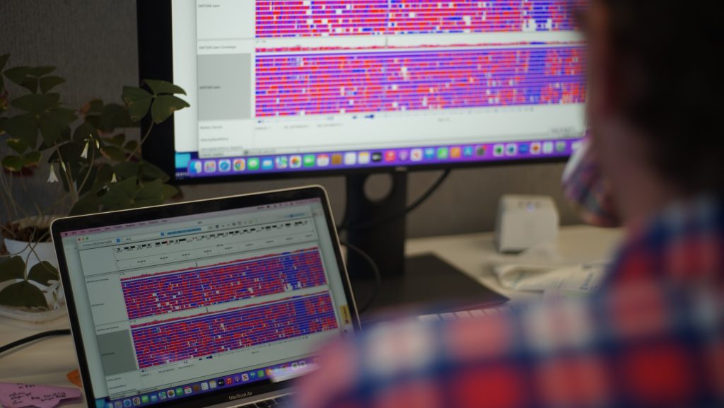
Then Elaine had an idea. She sent this slide from their fundraising deck* and asked whether we could do something with the image on the bottom. The image is core to Moonwalk’s technology and Elaine thought that—perhaps with different colors—it could be a design motif on the website.
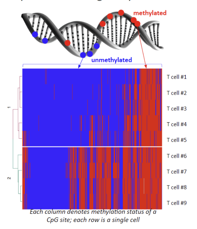
I loved this. I’m not sure why, but looking at the image up close felt somehow architectural—it reminded me of walking along The High Line in NYC. We looked at different color combos. We added text. It started to feel good. We could lead with it.

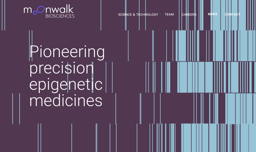
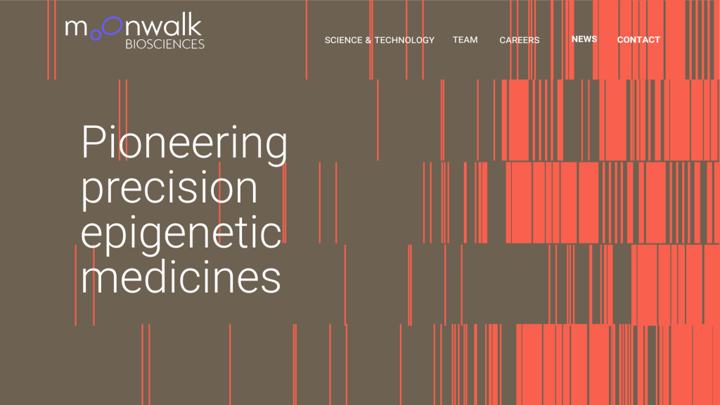
We then added very subtle animation. Subtle because the words matter a lot and we didn’t want to distract people.
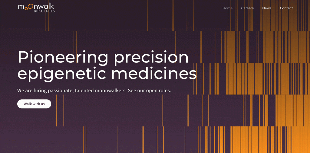
I love that it looks good and that it truly represents Moonwalk tech as you can see in this photo — which is actually on the website too.
We launched in tight synchronization with Kimberly and her team at KKH Advisors who secured coverage in multiple outlets including the print business section of the WSJ newspaper, and STAT, Endpoints, Fierce and others. All were immediately added to the Moonwalk site news page — with some promoted on the homepage.
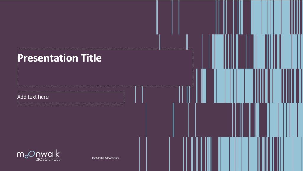
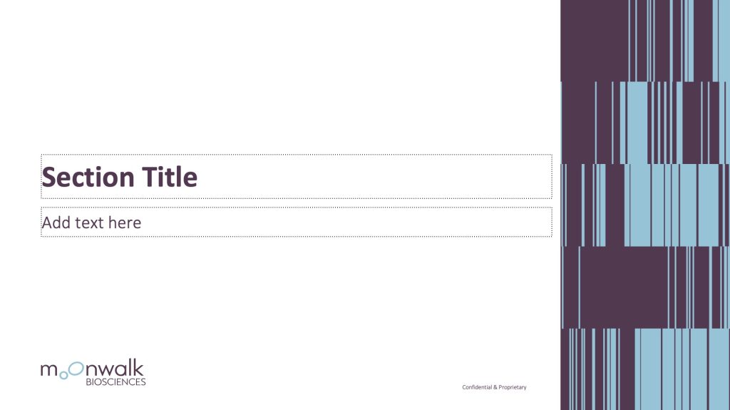
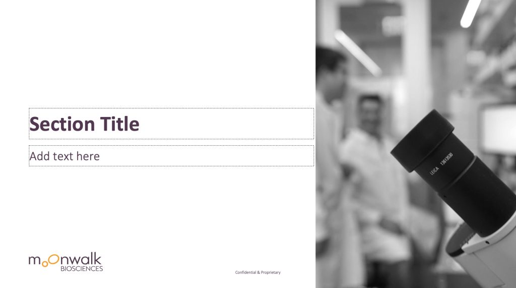
* As part of our project, Elaine asked us to redesign Moonwalk’s presentation deck to have a look and feel like their website. So that initial slide looks pretty different now.

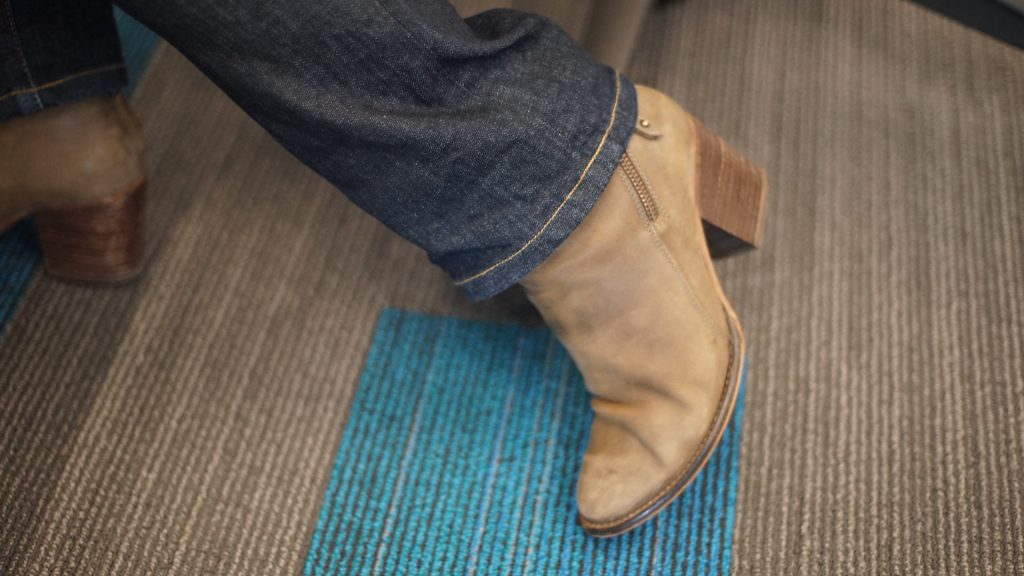
BTW I should have known about Elaine. She has great boots!
Leave a response
Responses
No responses