At BKW we’ve been longtime users of a service called Free Conference Call HD.
It’s a great service.
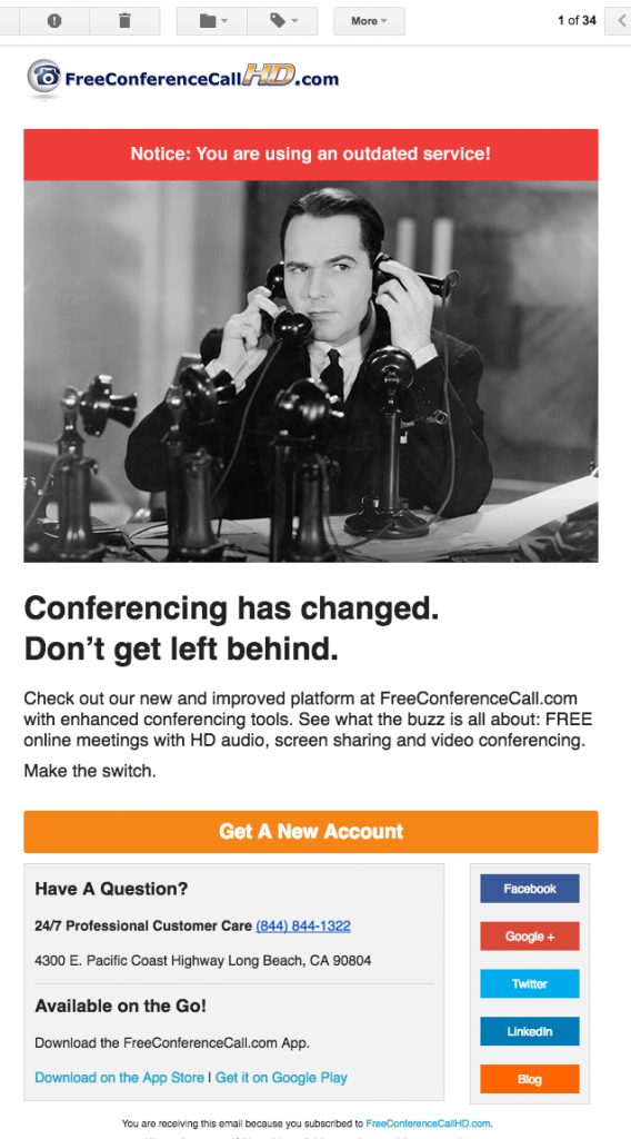
But now I’m confused. Today I received the following mail from them:

The Problem
I have no idea what I’m looking at?
Do I need a new account? “Get a New Account” is the the only obvious button I’m prompted to click. Yet, when I click it nothing becomes any clearer.
The Solution
Sending mail to customers isn’t rocket science, but it does take some time and preparation. The number one rule is get in their head. Try to imagine what they don’t know – things that are clear to you, might not be so clear to your readers. Never assume. And if you’re feeling overconfident, remember the “tappers and listeners” experiment.
Email marketing has been around forever (well forever in internet time, at least), yet it’s still one of the most effective tools out there (see stats). However, a tool is only as good as you make it, and if you write something that is as painfully unclear as this … you might end up with some confusing results. If other readers are anything like me, they probably clicked the link to see what was going on, remained confused, and then bailed. So you will likely end up with a decent “click-thru” rate, but very few people actually doing what you want them to ultimately do.
In my case, I’m just going to sit around and wait for them to send another, hopefully more informative, email. So it seems like designing, writing, and sending this one was a waste of resources.
How They Could Have Sent a Better Email
It appears the goal here is to get recipients to sign up for a new product. So say that.
And make the migration easy. Here are some other ways they could have done this.:
- Ideally the company could import all current customer accounts to the new service. Then send out an Email with details about the switch, and a link to re-activate the imported account. This cuts out a lot of work and confusion on the part of the user. Don’t make your life easy — make your customers’ lives easy.
- If they didn’t want to import accounts, they should have given way more info about what’s going on. They should have preemptively answered questions such as: What’s the exact difference between this service, and the old one? and Will the old service be killed at some point?
- The “call to action” language is confusing. That orange button stands out starkly, and prompts a reaction of….“But I already have an account and I like it fine.” Something more explicit is in order here. Something like Try It Out, or Make The Switch would work better.
- After reading it for the 5th time, I noticed the box at the very bottom…They have an app! That’s an important selling point that’s buried in this email. And it could help make the switch happen.
- Branding is as important in mail marketing as it is anywhere else, yet the only hint of the brand I see in this mail is their logo. The company is actually not bad at branding. Every conference call I have been on using their service starts with “this conference is brought to you by Free Conference HD” so why are they skimping in this email?
Resources
Some of our favorite email marketing resources are these benchmarks compiled by Mailchimp—the service we use to send our mails at BKW. They’re updated frequently, and are a great way to measure your success against industry standards. They also have this super handy resource section with guides covering every email topic you could think of – and you don’t need to be a Mailchimp customer to read them.
Smart Insights have also compiled an impressive list of statistics on engagement, growth, and more.
And finally, if you’ve never heard of Awwwards.com, you should totally check them out. Besides showcasing the best sites on the web, they did a cool post on email design a little while back.
—-
Thank you Emer Kelly for adding to this post


Leave a response
Responses
No responses