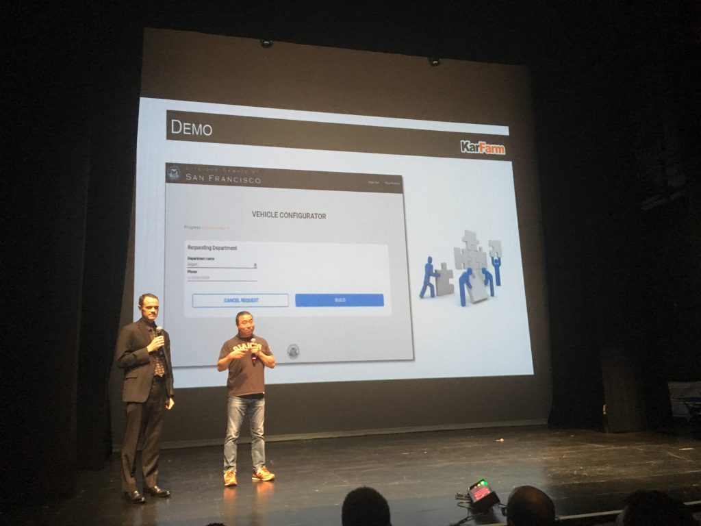
A couple weeks ago I watched ~15 companies present in one hour. That’s four minutes per presentation. As my photos will attest, it was a blur! I’ve forgotten most of them.
Being forgetful is, of course, not the goal of the presenters. I do remember one presentation. It stood out for its simplicity and effectiveness. Which means somebody on the team had the confidence to leave a lot of slides out. And to leave a lot of things off their slides.
Next time you present, spend more time on what you can leave out. Be confident in yourself. You will be great.
The presentations were given at STIR Demo Day 2016 in San Francisco. The startups had spent the past 16 weeks creating products for city departments in San Francisco, Oakland, San Leandro or West Sacramento. Each presentation was given by both a person from the startup and a person from the agency where they were in residence (AKA the customer).
The presentation I liked most was given by Binti, a startup focused on improving the adoption and foster care placement process. The presenters were CEO Felicia Curcuru and her customer Barrett Johnson – program director at the San Francisco Human Services Agency.
My notes are below each slide and you can scroll through them. If your eyesight is anything like mine you’ll want to go fullscreen.
Getting it wrong
Here’s an example of a presentation that lacked the discipline of simplifying and then simplifying again. Why do these guys need that clipart of little blue people building a puzzle? It pulls the eye away from the image of the company’s product. It gives people more stuff to think about and adds nothing. Kill it.


