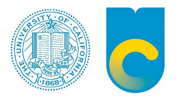
If you are not one of the 8 bazillion graduates of the University of California you might not know about this… but there’s been a major uproar over a new logo* the university system put out last year. Personally I kinda liked the new logo and could really imagine it coming to life in the many ways UC was promising. But, seemingly, the other 7.9999999999999999 bazillion UC grads, students and faculty did not.
There was at least one popular online petition asking UC to stop using it. There were many people complaining about it online. And it also got a lot of press. In mid December the university said the hoopla was too distracting to their communications team and they were going to stop using it. Here’s a press release from UC about their decision. Here’s a news article about it.
Why am I writing about it in YouTube Tuesday Plus? When UC announced their new logo they did it with quite some fanfare—including this video. It’s a beautiful video with paper cutouts and other nice animations. It’s soft and human and engaging. BUT… look how it did not aid (but actually hurt) the UC communications cause.
If you read what UC has to say about this controversy they say that they never intended to do away with the traditional “seal” (the one that people have thought of as the logo—the one that begins the video.) They say that was always intended to remain—on diplomas, etc.).
But in this video they literally dismiss it. They erase it and dust it away. They also cross it out. They make no attempt, it seems, to communicate that this seal is going to stick around.
Also, their attempts to show how elements and shapes of the seal would be incorporated into the new logo are weak at best.
People don’t like change and they need it broken to them carefully. UC could have done a lot better job keeping people comfortable in this important communications piece. They could have bridged much more seamlessly from the old to the new.
To be fair, the seal does remain at the end of the video. But it’s covered up with many other elements and it’s unlikely many viewers would have stuck around that long.
*Actually UC calls it a monogram. A monogram is, BTW, a type of logo—one that combines the initials of an organization (in this case “UC”) into a graphic that overlaps the letters. If you’re interested, here’s what wikipedia has to say on the matter.


Leave a response
Responses
No responses